Jewelry E-commerce Redesign: UX & Sales Optimization
Redesigning the online store of a family jeweler with three generations of history: a warm, luxurious experience that is easy to shop, with a catalogue of over 2,000 designs and a design system of its own.
Context
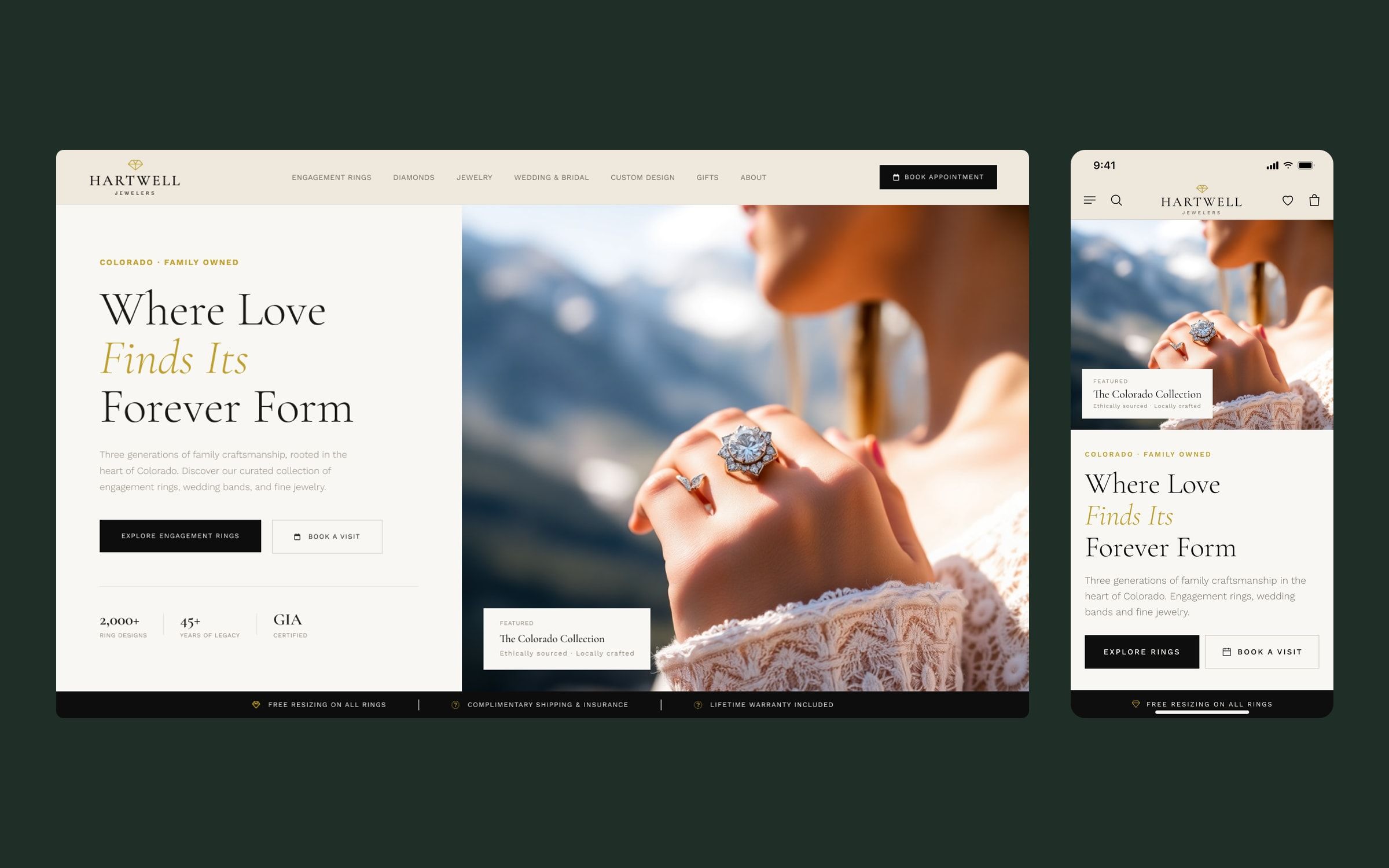
A family-owned jeweler in Colorado, three generations in the trade, wanted to rebuild its website. It sells engagement rings, wedding bands and fine jewelry, designs custom pieces and offers financing, and it needed a website that lived up to the experience it gives in store.
I worked on it with the Twelve Legs Marketing team, owning the UX/UI design of the whole site and its design system. The project is confidential, so the brand shown in the images is fictional.
Challenge
The brief asked for a delicate balance: a luxury jeweler, but minimal and clean, never overwhelming the shopper. And at the same time, a story of its own. The family wanted the site to convey its Colorado pioneer roots and a subtle touch of patriotism from the owner’s military service, without looking like a copy of the big chains.
Behind it sat a huge catalogue, with over 2,000 ring designs, filters for metal, shape, carat and setting, and expensive, emotional purchases where financing and an in-store appointment matter as much as the product.
Process
The client had a clear reference: a large US jewelry chain, for how easy it is to navigate, how it recommends products as you scroll and its bridal inspiration content. I took the ease of use from it and put it at the service of a tone of its own: warm, personal and trustworthy.
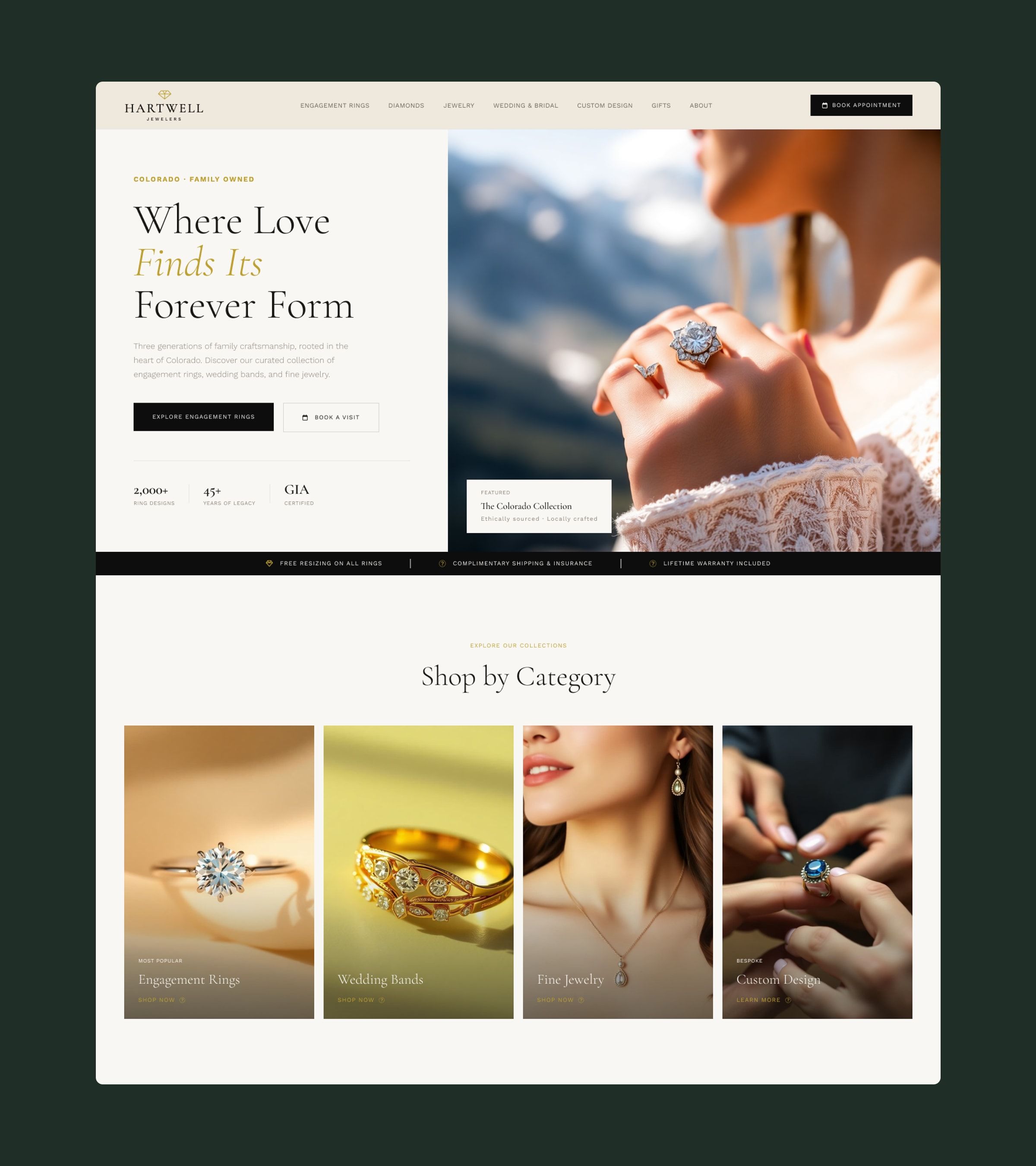
I started with the design system: a cream, gold and charcoal colour scale with semantic aliases, Cormorant Garamond for editorial headings, Work Sans for body copy and interface, and a spacing and radius scale. On top of it I designed 13 desktop templates, from the home page to the product page, the family story, financing, the blog, the resource guide, the thank-you page and the 404, plus the six mega menus.
Solution
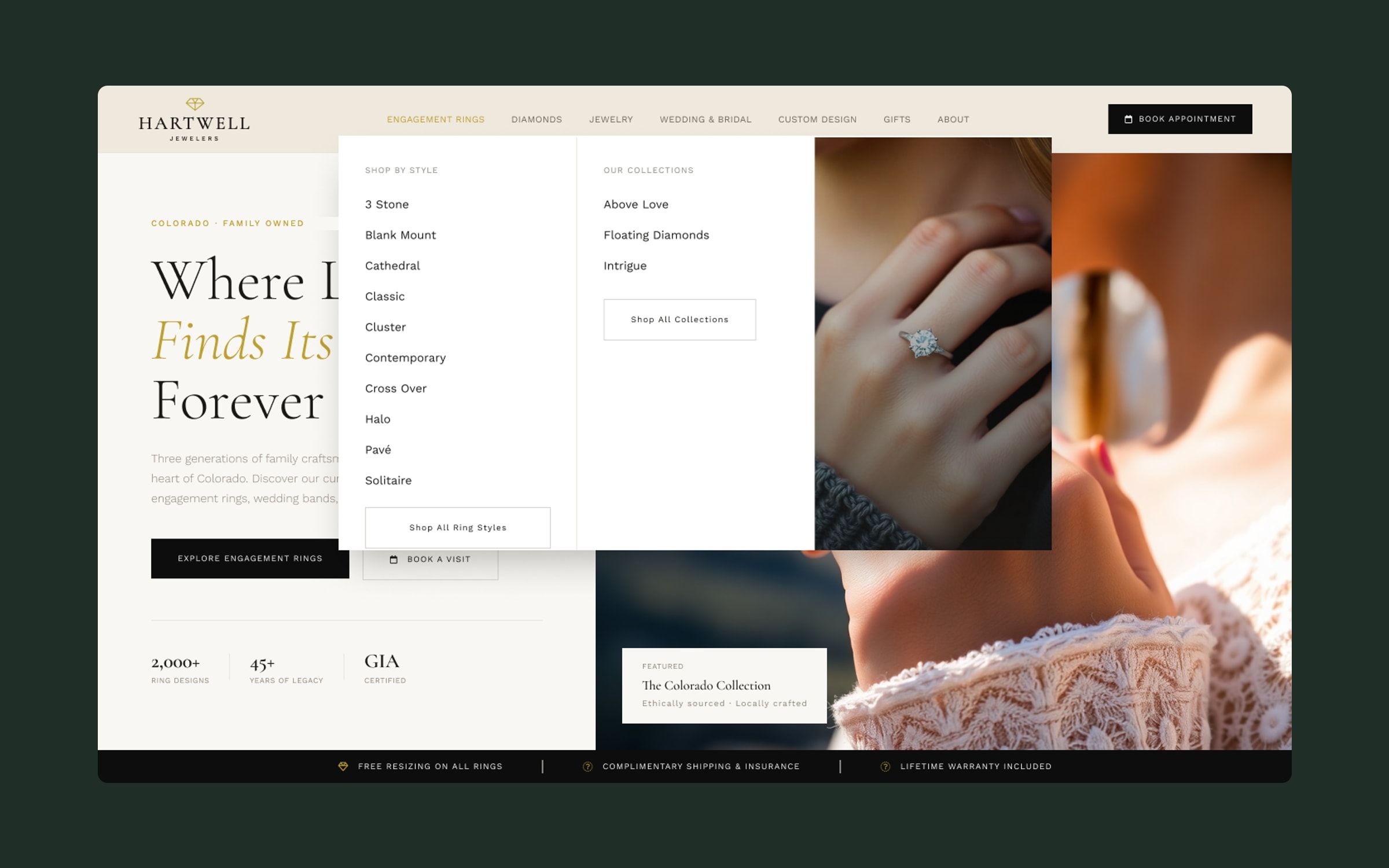
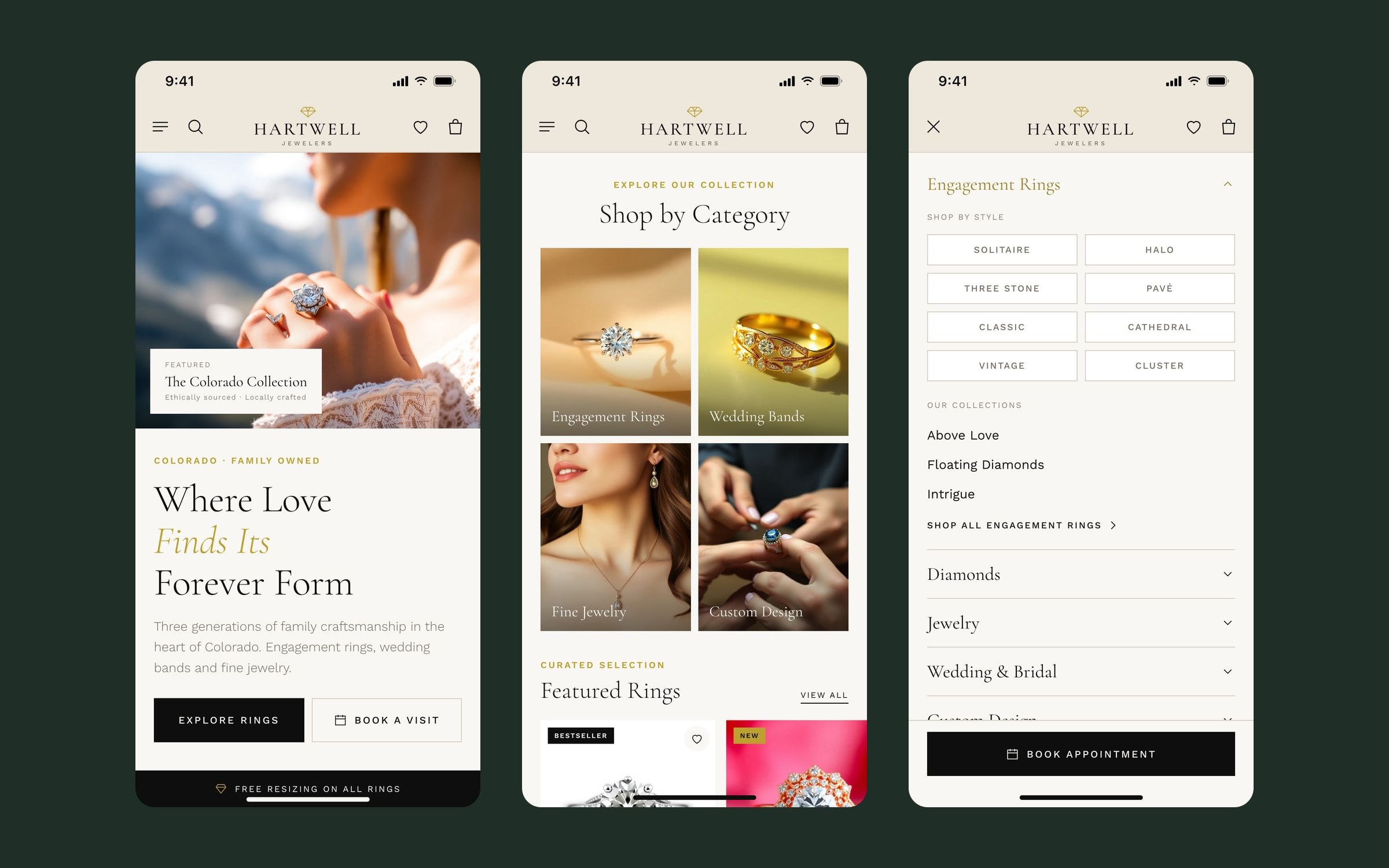
- Mega menu navigation. Each main section opens its styles, collections and an image, so any part of the catalogue is two clicks away. Booking an appointment is always in view in the header.
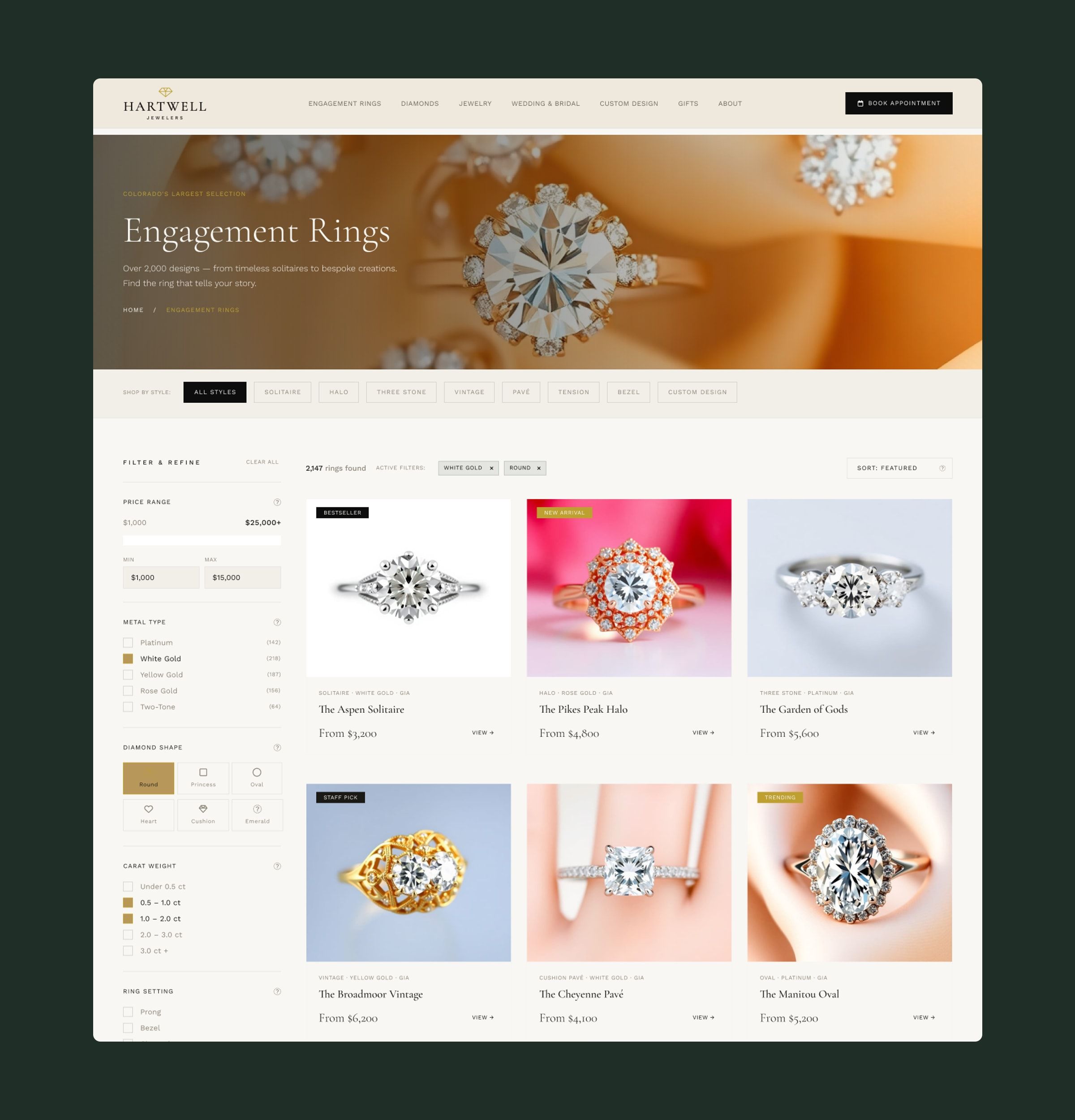
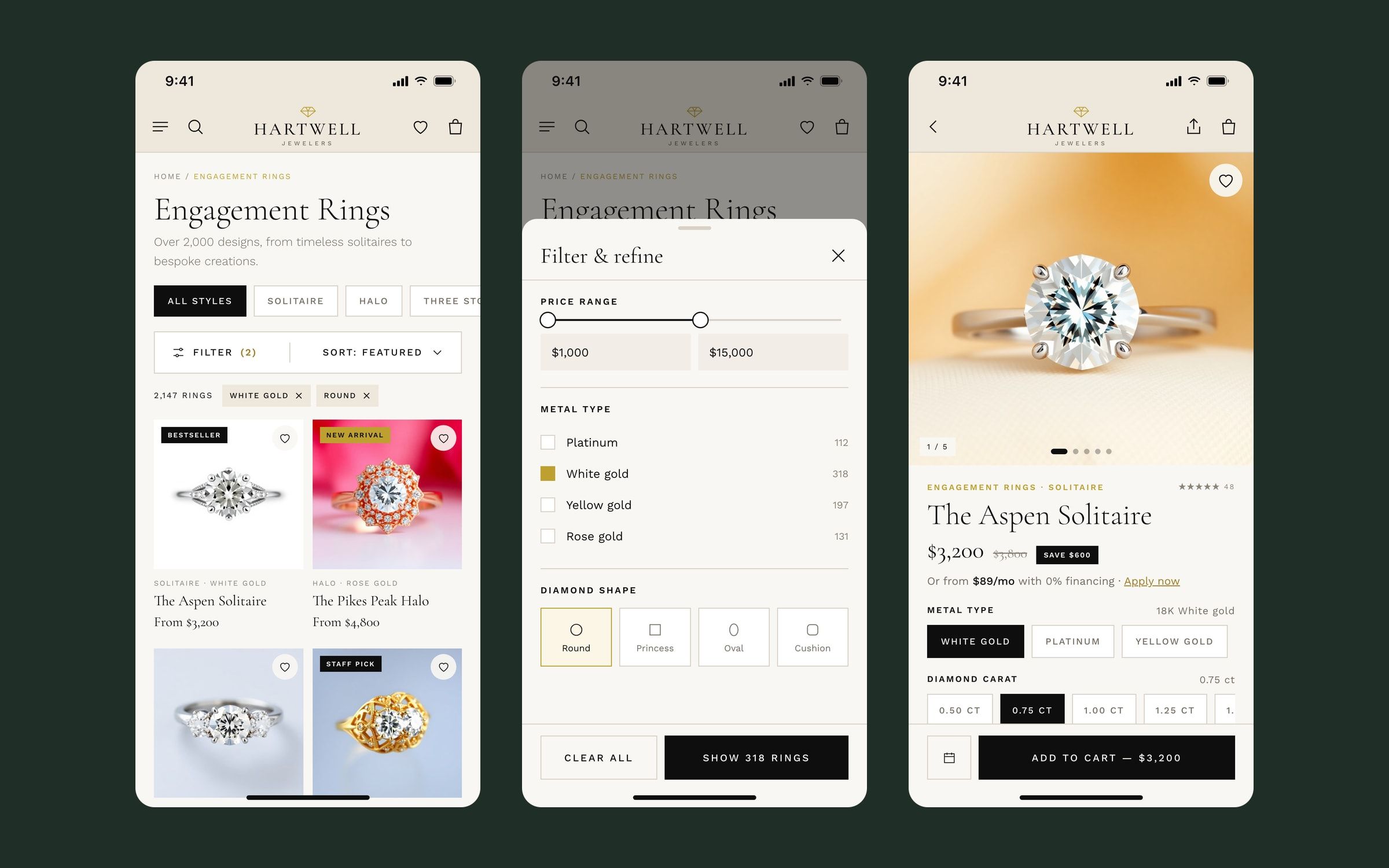
- A catalogue that filters itself. Styles as quick links at the top, filters for price, metal, shape, carat and setting in the sidebar with result counts, and active filters visible above the grid.
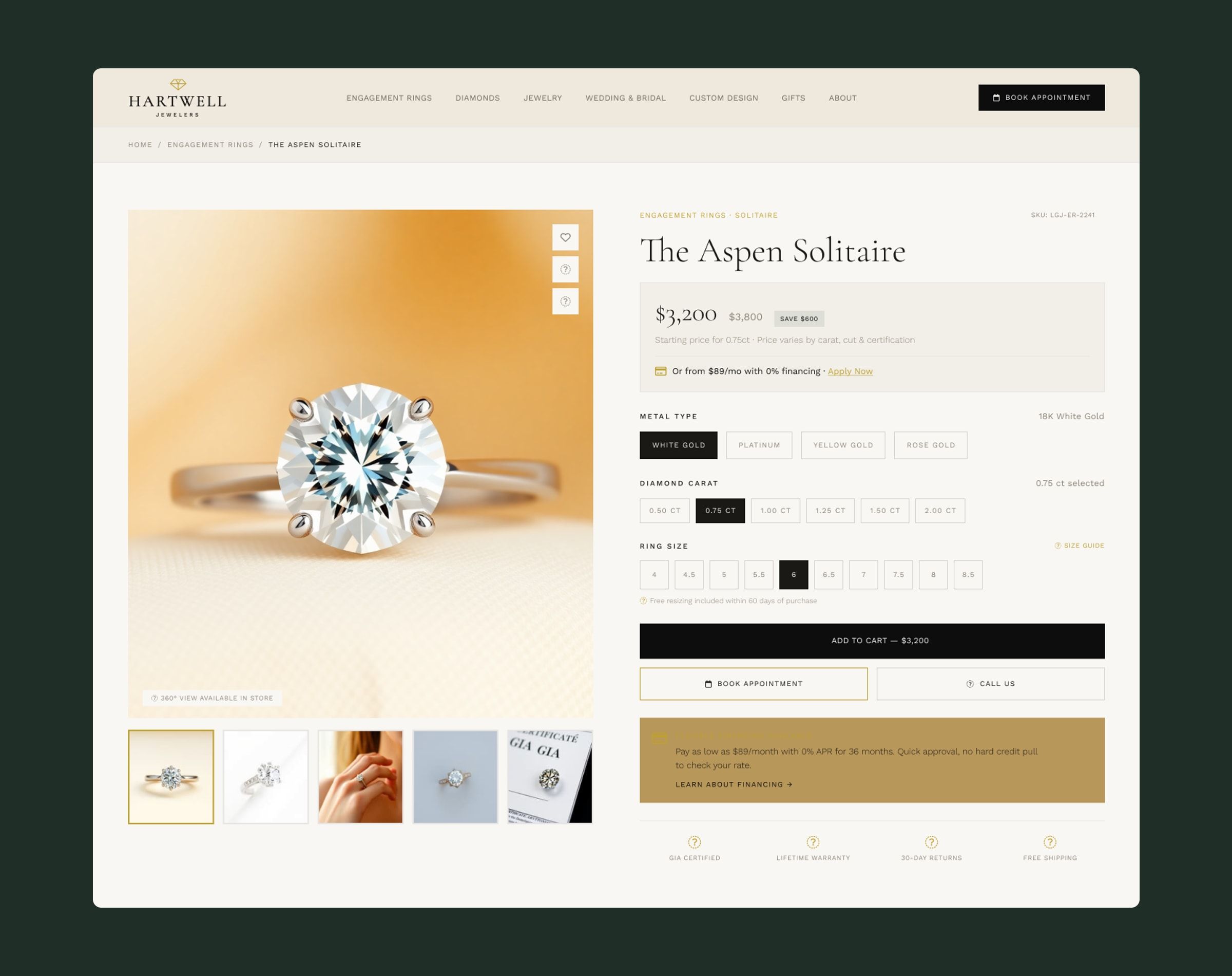
- Product pages that answer before you ask. Price with the saving, a monthly payment with 0% financing, metal, carat and size selection, and booking an appointment right next to buying.
- The story, in its place. The family legacy and Colorado show up in the tone of the copy, the names of the pieces and pages of their own, without getting in the way of shopping.
Mobile version
For this portfolio I adapted the key journeys to mobile, based on the desktop templates and the same design system. The menu becomes an accordion with styles as buttons, filters open in a bottom sheet that shows how many rings are left, and on the product page the buy and appointment buttons stay fixed at the bottom, within thumb reach.
Outcome
I delivered the full site design together with its documented design system, so the team could build and extend it without losing consistency.