Luxury B2B/B2C E-commerce: Furniture Reservation
An online store for renting luxury event furniture and décor, where the cart ends in a quote request instead of a payment. End-to-end UX/UI design and frontend implementation.
Context
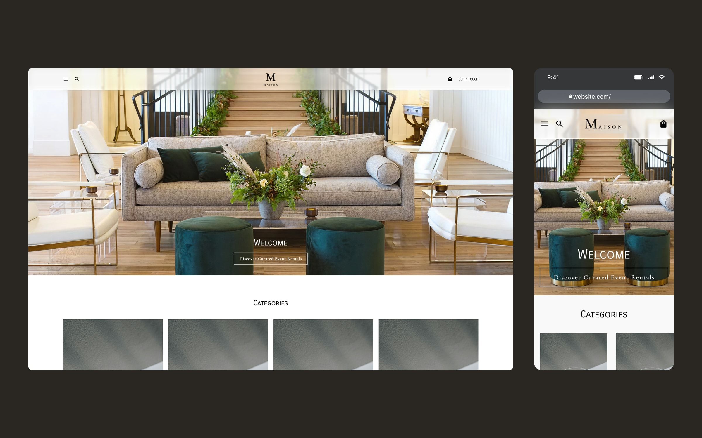
A US company renting furniture, lighting and décor for high-end events (weddings, private celebrations and brand events) wanted to become the luxury reference in its market. Its website did not help: the client itself described it as boring, set up like a blog, with no product pages and no sense of luxury.
I worked on it as part of the Twelve Legs Marketing team, owning the UX/UI design of the whole store and its frontend implementation. The project is confidential, so the brand shown in the images is fictional.
Challenge
The brief spelled out the problems: the offer was not clear from the website, price raised doubts, and the brand sometimes came across as “a small garage-based operation”, the opposite of what they wanted to convey. And the only way to request a quote was by phone.
On top of that, renting is not buying. The final price depends on dates, delivery and the number of pieces, so the store could not end in a payment like a regular e-commerce site. All of this for a demanding audience that expects full, highly personal service, across a catalogue of more than 30 categories, from a single glass to a full lounge set.
Process
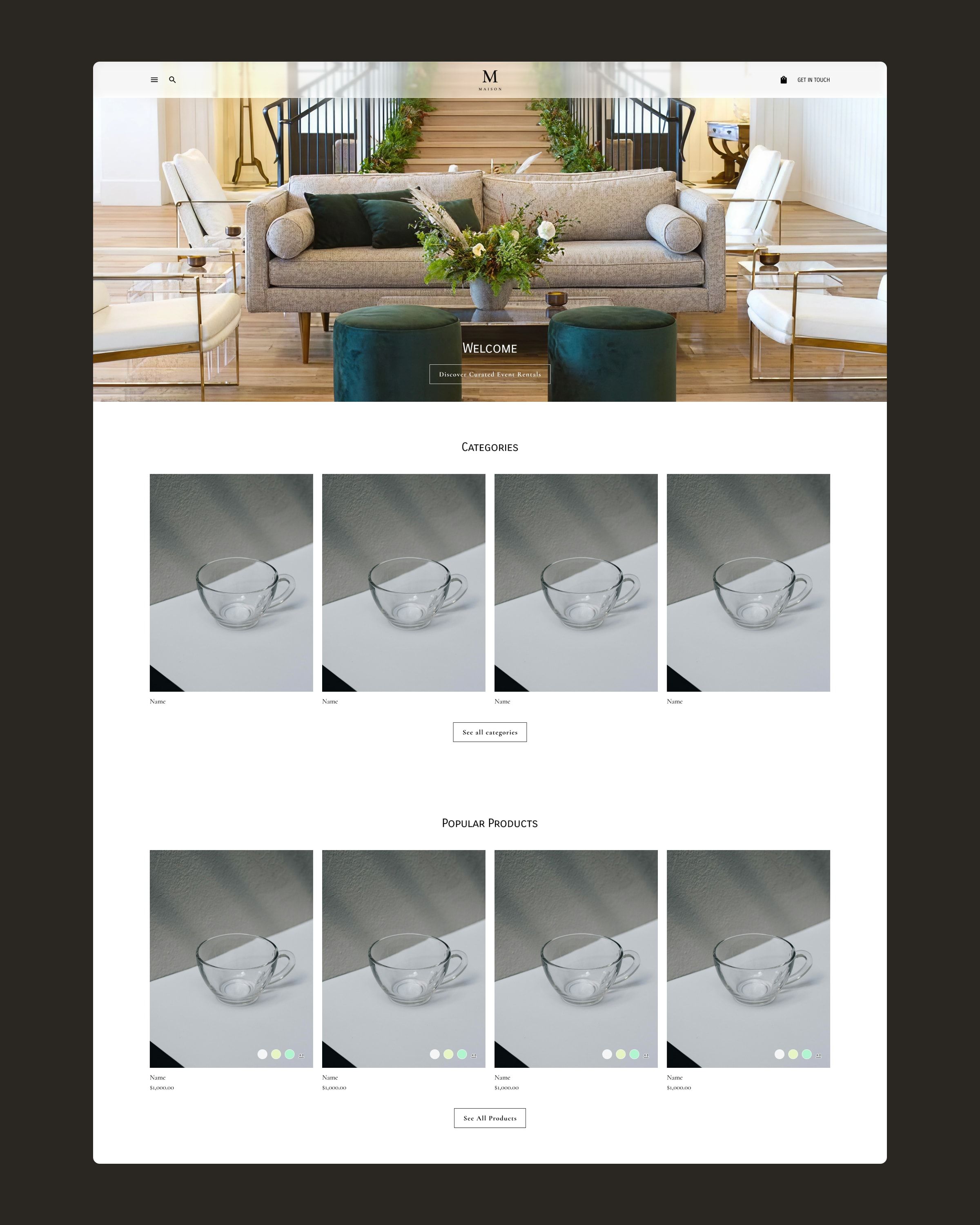
I started from the client’s brief: the feelings they were after (luxury, mystery, uniqueness and aspiration), the must-have features (product pages, cart, quote requests and filters) and their references, luxury rental and premium retail sites with full-screen imagery, a sticky menu and subtle animation.
From there I designed the 14 desktop screens of the journey and their mobile version, plus the open states for the menu, search and cart, on top of a system of styles and components in Figma. The visual language is restrained: white, black and a classic serif, so the photography of the events and the pieces takes centre stage and the brand reads as a premium service rather than a warehouse.
Since the store would run on WooCommerce, I shaped the structure around its product types from the start, so every screen translated directly when building it.
Solution
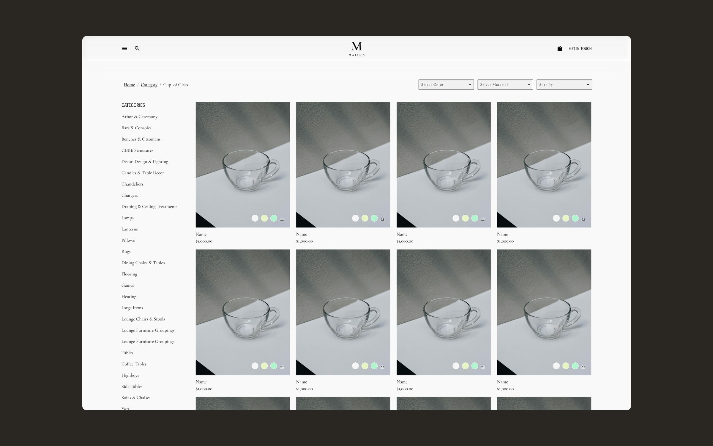
- A browsable catalogue. Every category stays visible in the sidebar, and listings can be filtered by colour and material or sorted. Cards already show each piece’s available colours, something the client explicitly asked for.
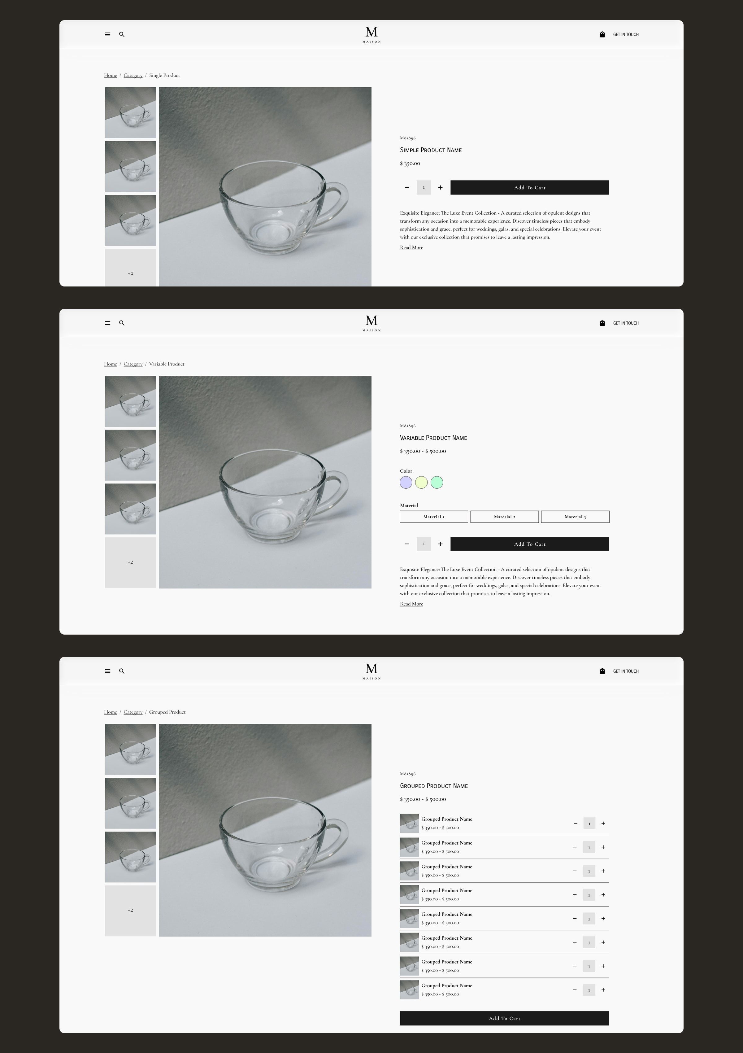
- Three product page types. Simple products, products with colour and material variants, and grouped products that let you add several pieces from the same set, each with its quantity, in one go.
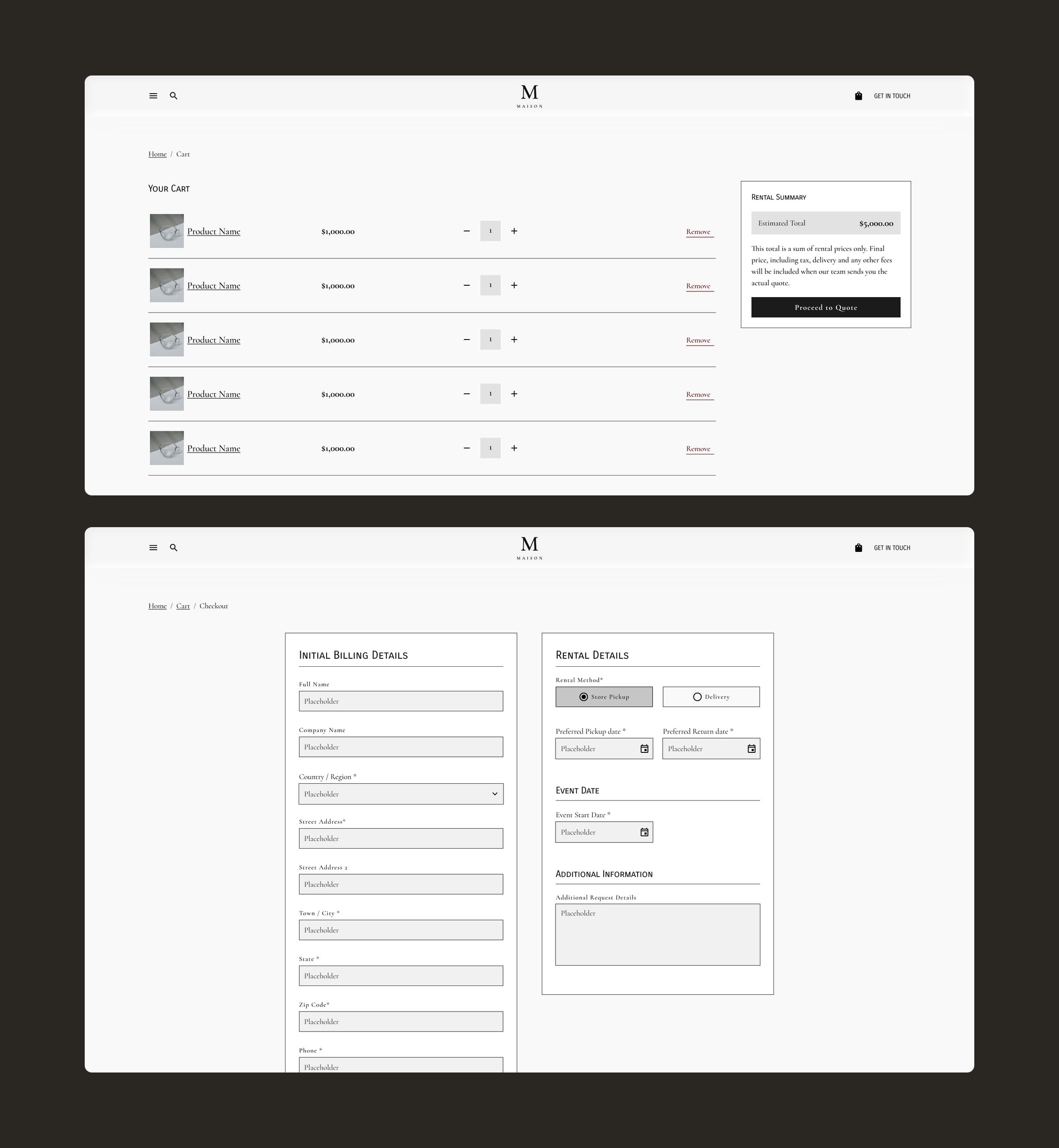
- From cart to quote. The cart adds up rental prices and explains that taxes, delivery and other fees come in the final quote. The main button does not say “Pay” but “Proceed to Quote”: quotes, which used to be requested only by phone, now come from the website with the pieces already chosen.
- A checkout built for events. Beyond billing details, it asks for what the team needs to prepare the order: store pickup or delivery, pickup and return dates, event date and any additional details.
Mobile version
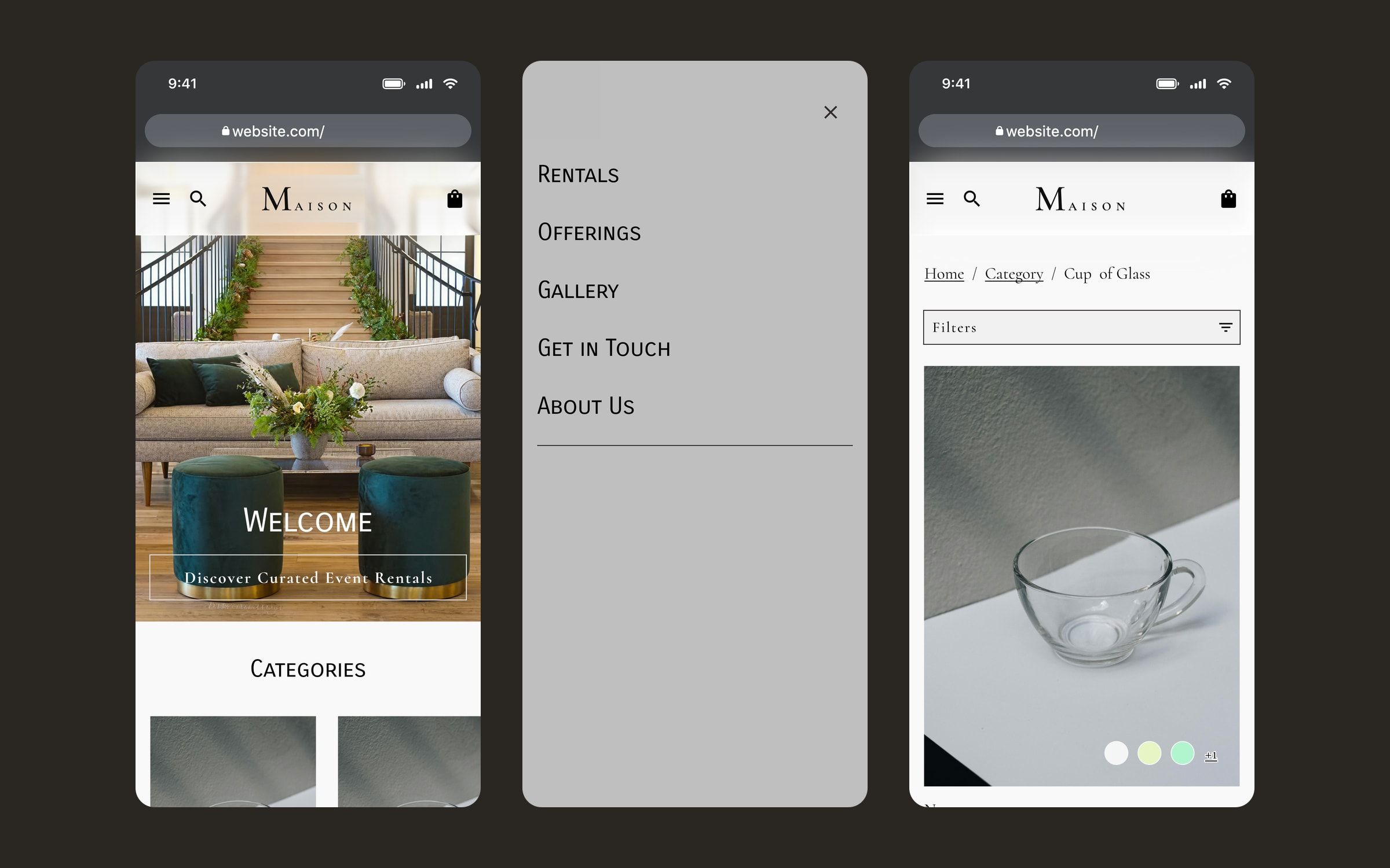
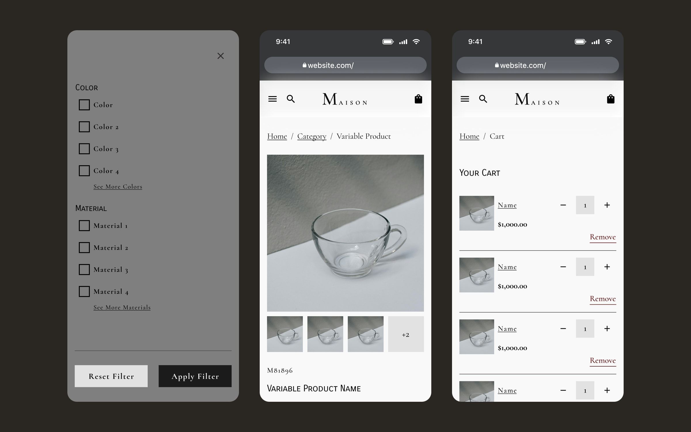
The whole journey has a mobile version. The header keeps only the essentials (menu, search and cart), the menu takes over the full screen, colour and material filters open in their own panel, and the cart keeps the rental summary and the step to the quote.
Outcome
The store is live, built on WordPress and WooCommerce with Breakdance, and clients can now prepare their event order online and receive a tailored quote.