Real Estate Platform: B2B/B2C Information Architecture
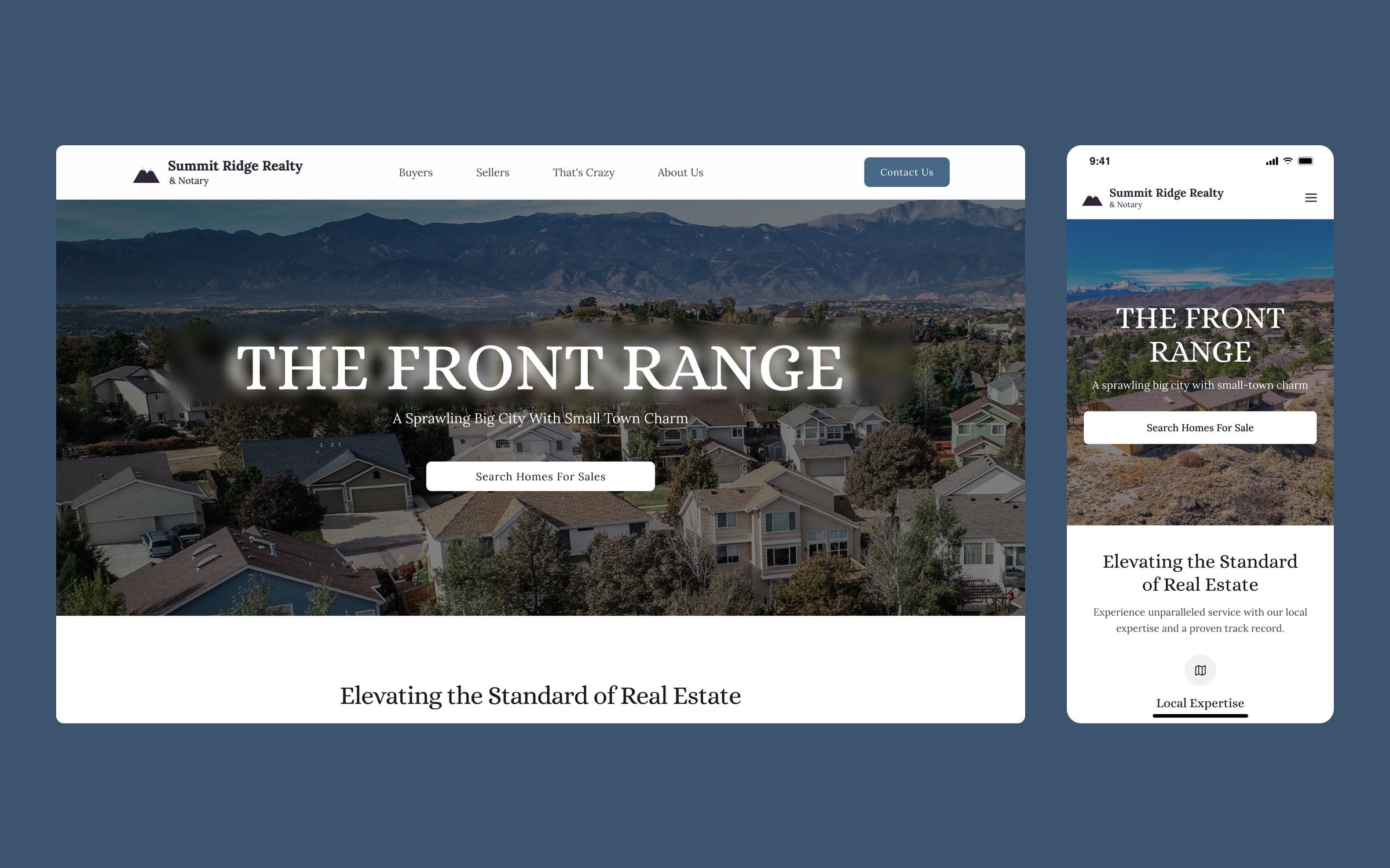
The website of a local real estate agency, with separate journeys for buyers and sellers, home valuation and a program for military families. UX/UI design and frontend development.
Context
A local real estate agency in Colorado, which also offers notary services, wanted a new website. Its value lies in knowing the area and supporting each client from start to finish, something the big property portals don’t convey.
I worked on it with the Twelve Legs Marketing team: I designed the whole site and handled the frontend development. The project is confidential, so the brand, addresses and identifying copy have been changed in the images.
Challenge
A small agency competes with portals that have every home and every filter. The website couldn’t win on volume, so it had to win on trust and closeness: explain how they work, give reasons to get in touch and show who is behind it.
On top of that, buyers and sellers arrive with very different questions, and both processes are long and stressful.
Process
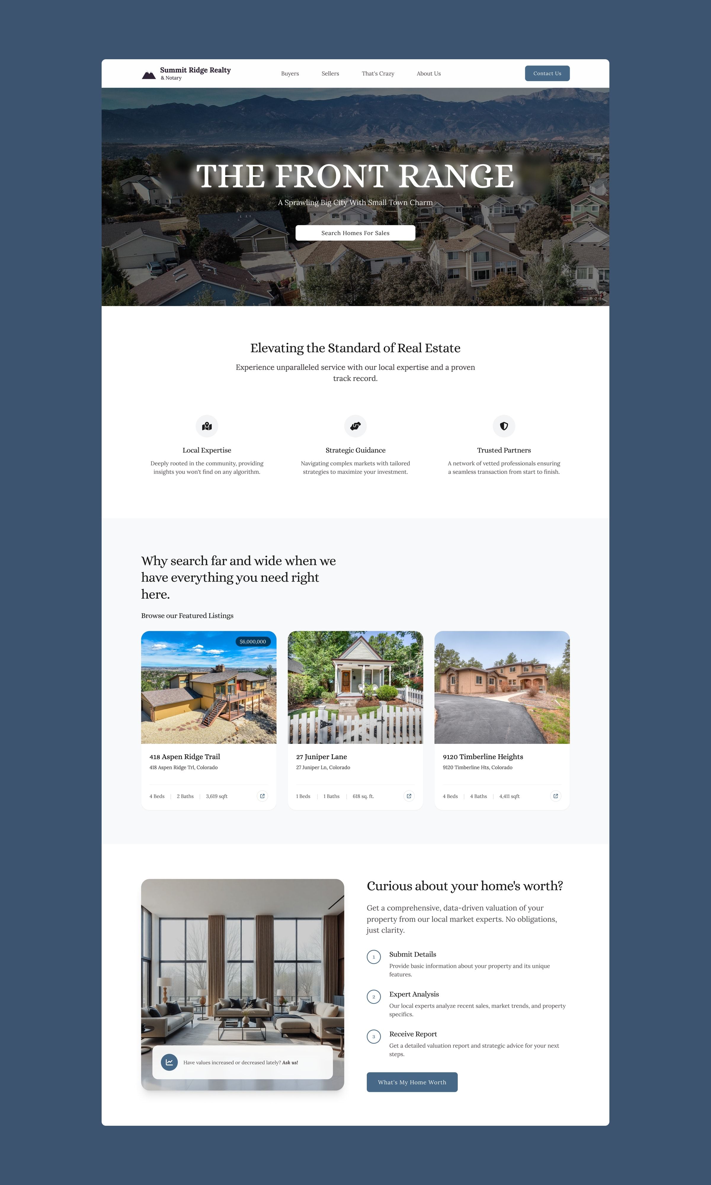
I designed the home page, the buyers and sellers pages, the agency page, the privacy notice, the thank-you page and the 404, on a simple system: a classic serif for headings, light backgrounds, a steel blue for actions and photography of the area.
Each audience has its own page, with its own step-by-step journey, advantages and testimonials. The home page routes to both and gathers what serves everyone: featured homes, home valuation and access to the local MLS searches.
Solution
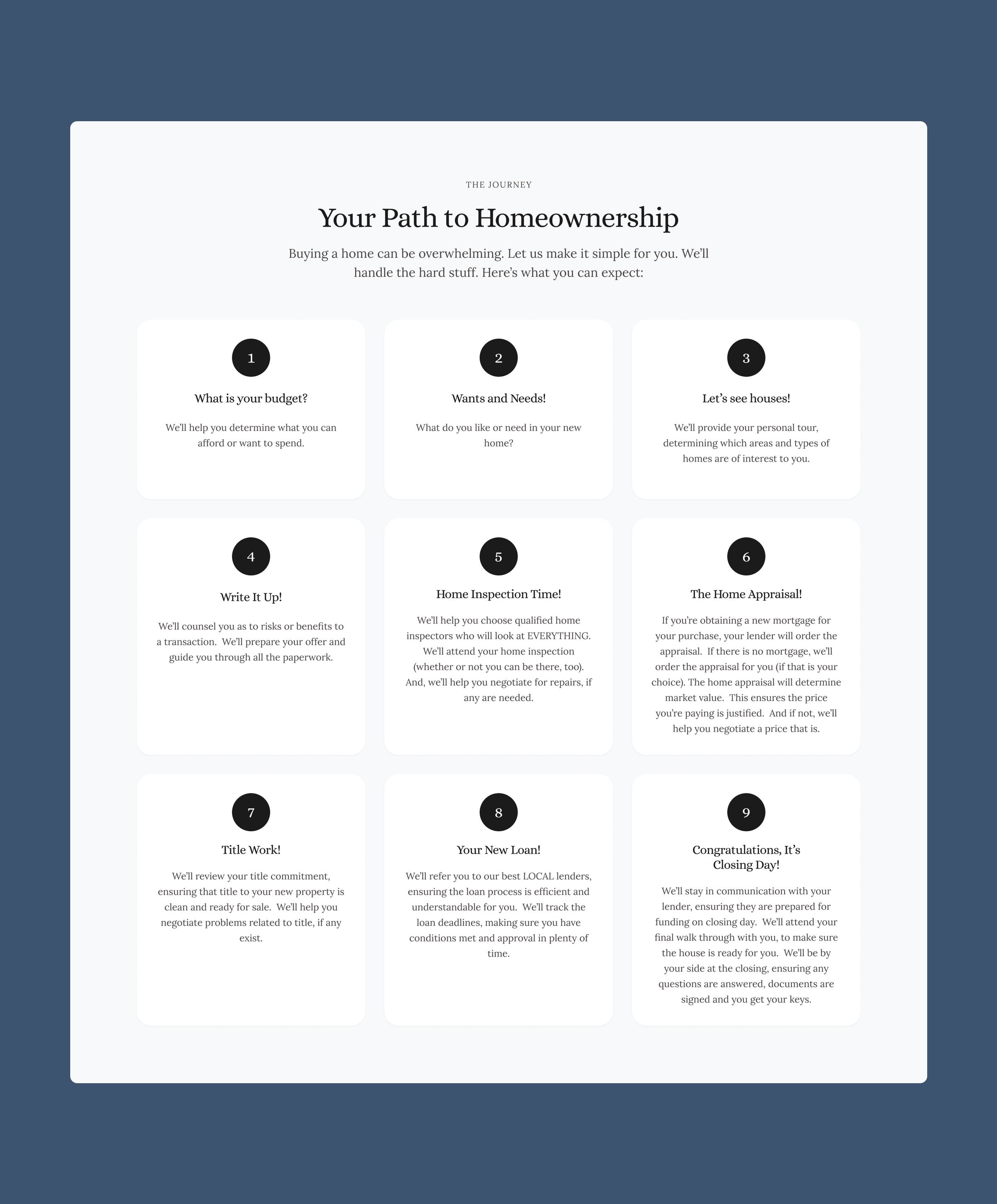
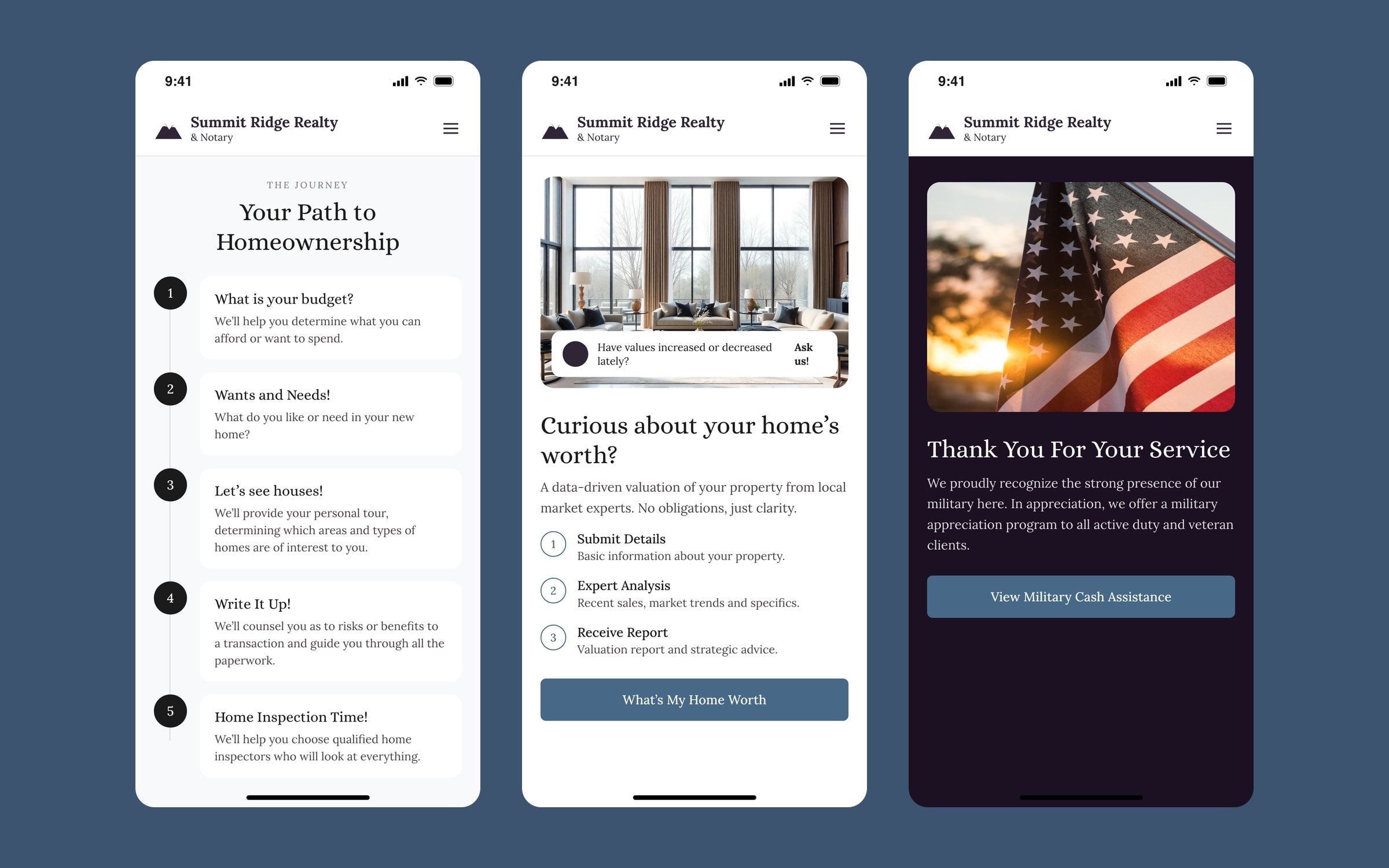
- The process, explained. Buyers and sellers each get a journey in numbered steps (nine for buying, eleven for selling) that tells them what happens at each stage and how the agency helps.
- Valuation as the way in. “Curious about your home’s worth?” explains in three steps what the owner receives, with no obligation, and is the main call to action for sellers.
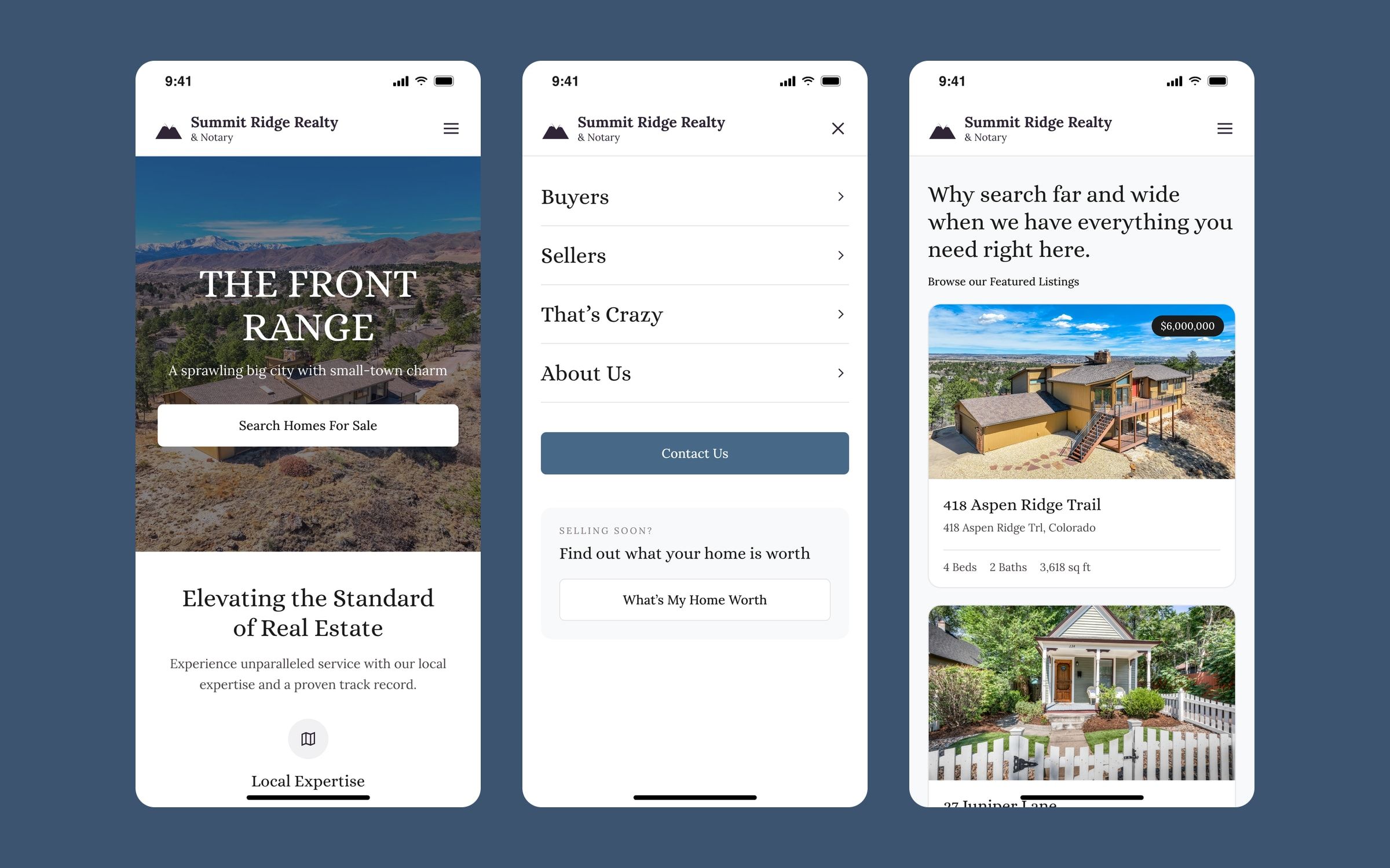
- Featured homes without competing with the portals. A selection of listings with price and key details, plus direct links to the MLS searches for anyone who wants to see the whole market.
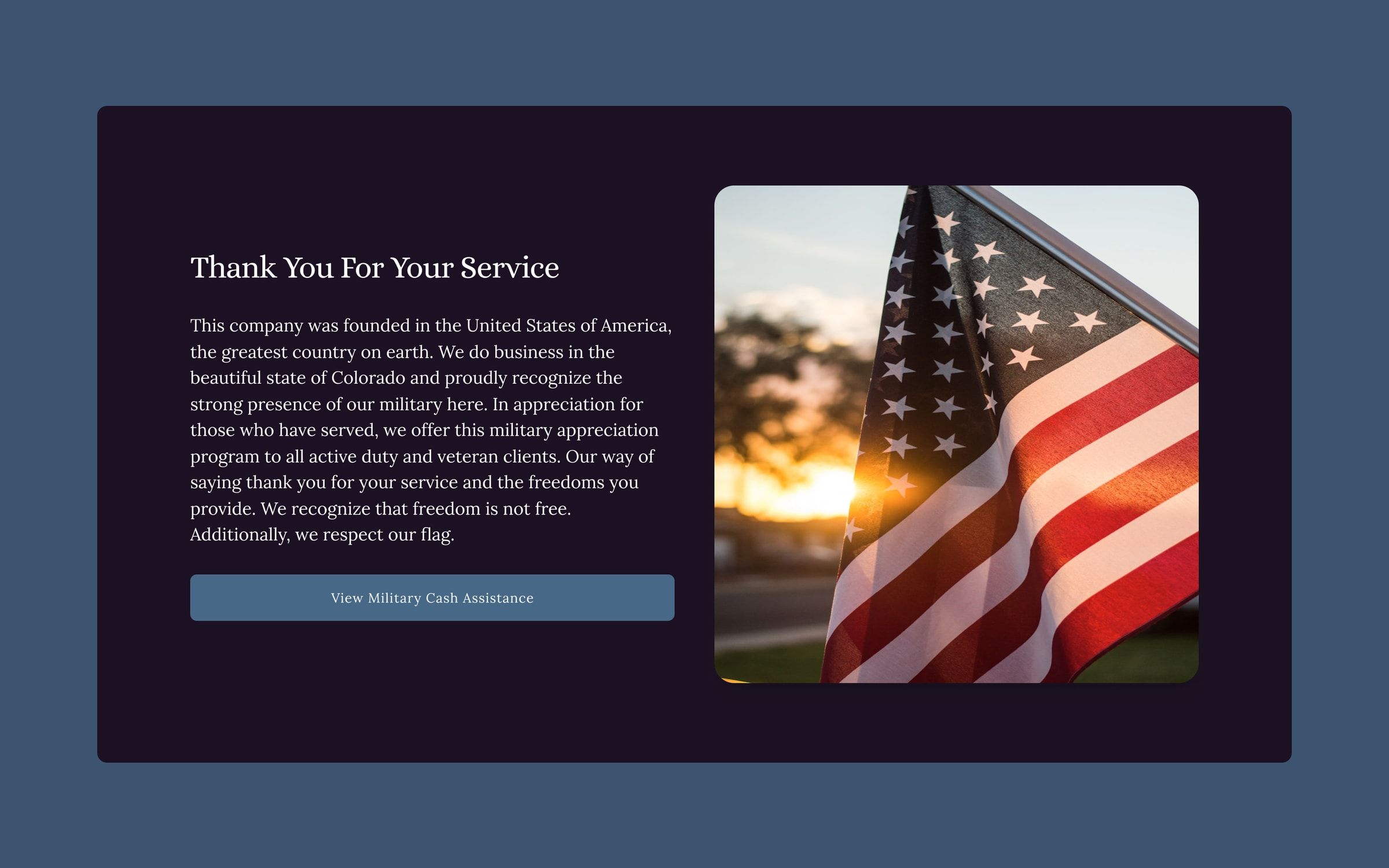
- A program for military families. A dedicated section presents cash assistance for active duty and veteran clients, in an area with a strong military presence.
Mobile version
For this portfolio I adapted the key screens to mobile with the same system. The menu takes over the screen and adds a shortcut to the valuation, the journeys become a vertical line of steps, and listing cards stack with the key details in view.
Outcome
The site is live: it explains how the agency works, makes valuation its main call to action for owners and stands apart from the portals through its closeness and trust.